 Contact Us


You don’t need a lighting desk or an external console to control your projects. Control Module UI's give you the possibility to create your own user interfaces, which can be used in your browser throughout the network. In this article, we will go over how to create a UI and some basic workflows that it can be used for.
Setup
To create a new UI, select a Module, switch to the “UI” tab, and press “Add UI”. By clicking on the pencil icon and then the plus icon in the upper left corner, you can add different control elements like Buttons and Sliders. To see a full list of Elements, take a look at this article: Module UI Elements.

Add Control Module UI to separate pane
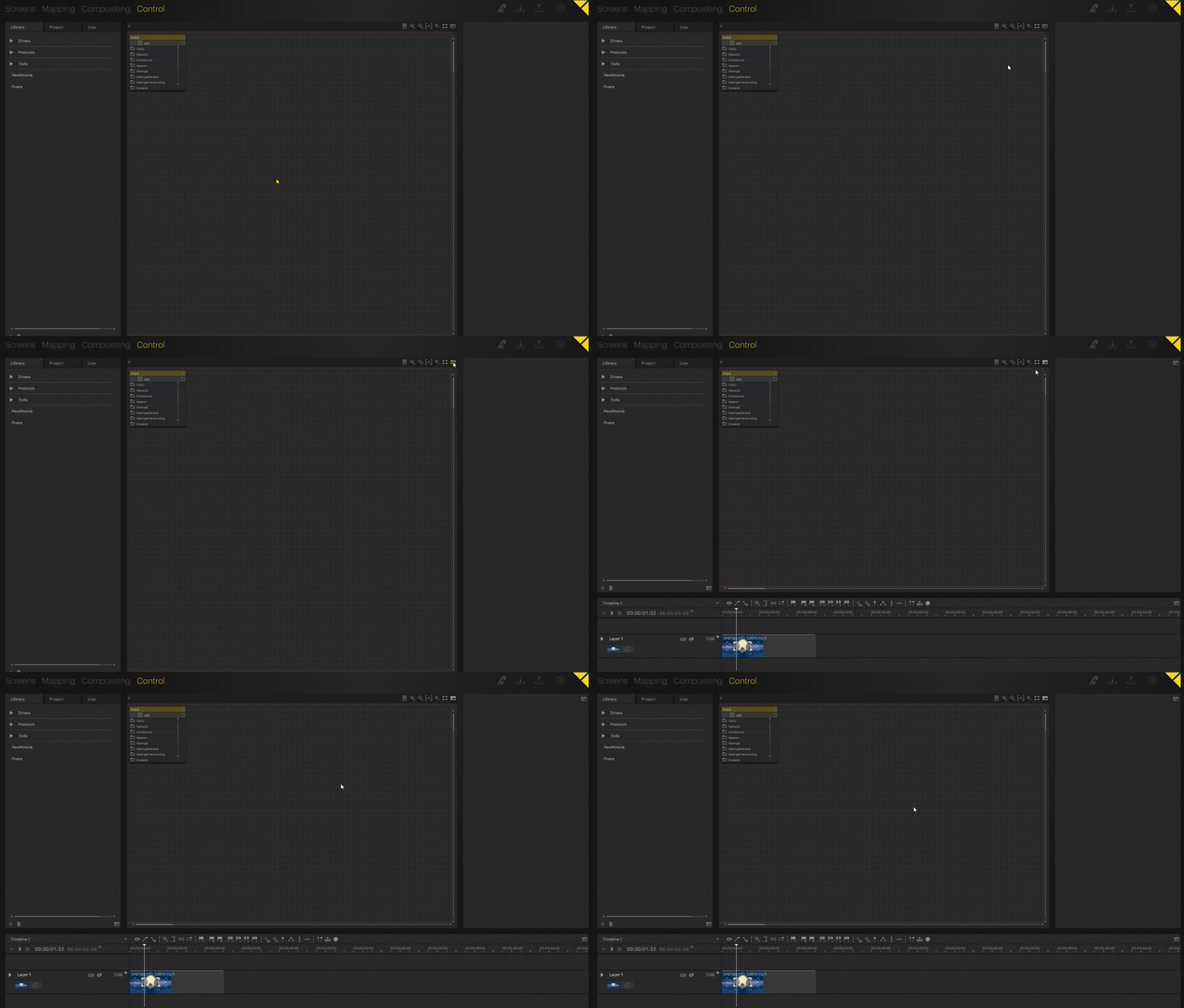
If you want to use your UI pane in Screens, Mapping, Compositing, or open it separately from the Control inspector, you can add the module to an empty UI pane. Read more about panes in Window Pane Management.

This way, you can have several control module UIs open at the same time:

You can also edit the module's UI by toggling “Edit Mode” under the three-dot menu of the pane, which will make the familiar pencil icon appear.

You can then edit the UI from any pane you added to your UI much in the same way as in the Control inspector, as described below.

Play Timeline Button Example
The most basic operation is to play a Timeline. Functionalities can be added to a Control Element (like a Button) in four ways. The fastest one is to do it directly in the UI without the need of a separate Action.
1. Enable "Edit" mode if not already enabled by pressing on the pencil icon in the top left corner, this changes between “Edit” mode and “Active” mode.

2. Press on the plus icon in the top left corner and select “Button”.
3. Select the Button Element you created and click on the arrow shown above it, this will offer you the Module from which you want to use an Action. In this case, we want to work with the “Pixera” Module.

4. If “Pixera” is not shown as an option, keep the button selected and click on the “Expand” icon, which will show you all available Modules. Select “Pixera”.

5. Click on the arrow again, and select “Pixera → Timelines → [Timeline you want to affect] → play” to attach the play Action of that Timeline to this Button.

6. You can also rename the text on the Button by selecting it, and changing the value in the “Label” field.

7. Don’t forget to save the changes made to the UI with the store button in the top bar. PIXERA’s won’t recognize changes inside the UI for auto saving or project saving, so manually using this button is needed.

8. The Button should now be ready to use. Click on the pencil icon again to leave the “Edit” mode. Go back to PIXERA and to display the Timeline while in the Control tab, press the “Show Timeline” button above the top right corner of the workspace. Pressing the UI button should now play the Timeline.

Sharing your UI
We recommend using the “Open In Browser" button at the bottom of the UI tab to help more easily modify and use the UI. This will open the UI in the browser, allowing it to be brought to a separate screen/window.

Every device in the same network can also access the UI by using the same hyperlink. For instance, if you pass the link to a tablet or mobile phone, you can use it as your control device.
When sharing the UI, you may not want it to be editable by others once finished. In the Module after a UI is built, you can deactivate the option “UI Is Editable” in the “Properties” tab. From then on, this UI will not have the pencil icon, meaning you cannot go into “Edit” mode.

Next Steps
Now that you have a general idea of how to setup UI's, follow these links for more detailed information on workflows involving UIs:
- Module UI Elements: All UI Elements that can be found in Modules, what they do, and how their settings work.
- CSS Styling In Control Module UI's: General Overview of all CSS Styling Workflows and how to use them.
- Aux Directory, Add Media and CSS Files to Your User Interface: Specific information on how to use Aux Directories for Elements and CSS files.
- CSS Styling Advanced and Specific Examples: Advanced examples on how to use CSS styling.
- "Style Action" to Change the Style of Module UI Element: How to use Actions to change styling.
PIXERA 2.0.223 | 18. December 2024 | CL